Tool-be
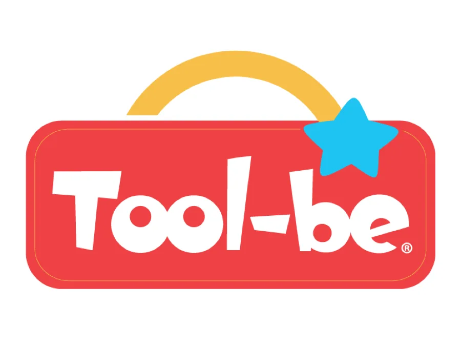
Website proposal for the Tool-be System, a development platform for early childhood (the first 1,000 days of life). A playful homepage that introduces the system, its program for families, and its offerings for businesses and governments.
About the project
Tool-be supports children’s development during their first 1,000 days. The site needed to feel as warm and playful as the brand while also organizing a wealth of information: the system, the music (created using neuroscience), the real-life stories, and the offerings for businesses and governments.
The proposal uses waves, solid colors, and the brand character to guide the user through clearly defined sections: System, Family Program, Our Secret (the music), Life Stories, and For Businesses & Governments, and concludes with the app in stores.
The visual system maintains its playful identity (blue, red, orange, and yellow; rounded typeface) without compromising readability or hierarchy.
Early Childhood · First 1,000 days · Home and landing · Playful brand · Responsive web
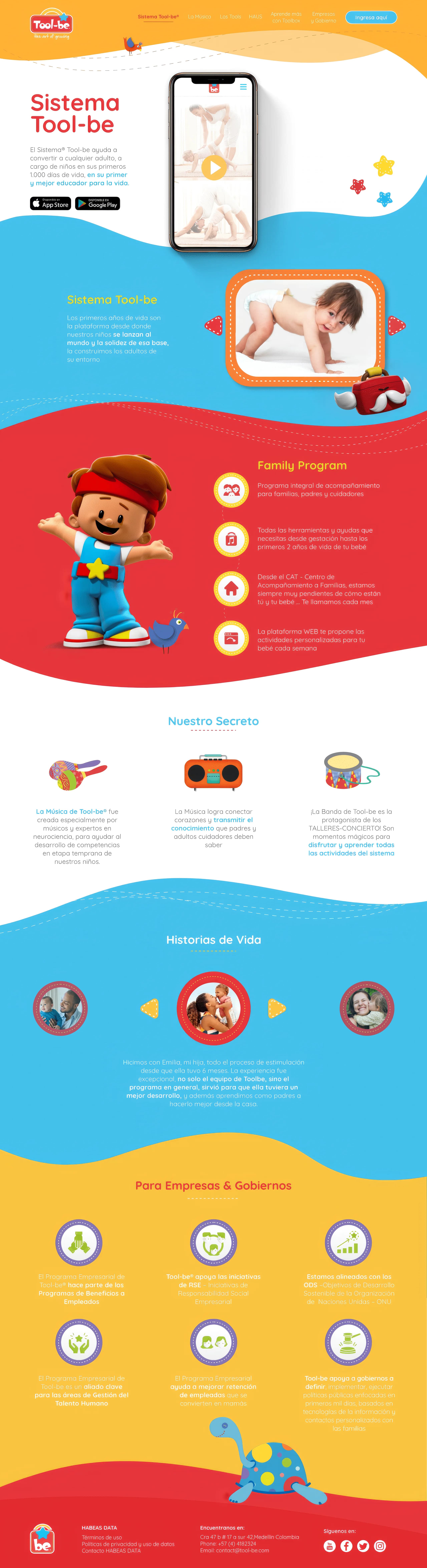
UI Kit